Ringling Film Ident
01 RESEARCH
THE BRIEF: Create a memorable identity for Ringling College Film Program that creatively but concisely captures the professionalism and creativity of the student films.
My first thought was to ask my friends in the film major to send me their projects. I figured that the best way to find the essence of the film department was through the work which the students created.
Once I had watched through a multitude of ideas, I was struck with an idea...
02 IDEATION
What better way to showcase the professionalism and creativity of student films than to actually showcase student films?
I sorted through various footage and asked my friends which of their shots were their favorites. A few even sent me shots that never made the cut in final films, but they loved them anyways.
My direction started to lean towards feeling as epic as a professional studio while maintaining some youthfulness with a fun logo animation.
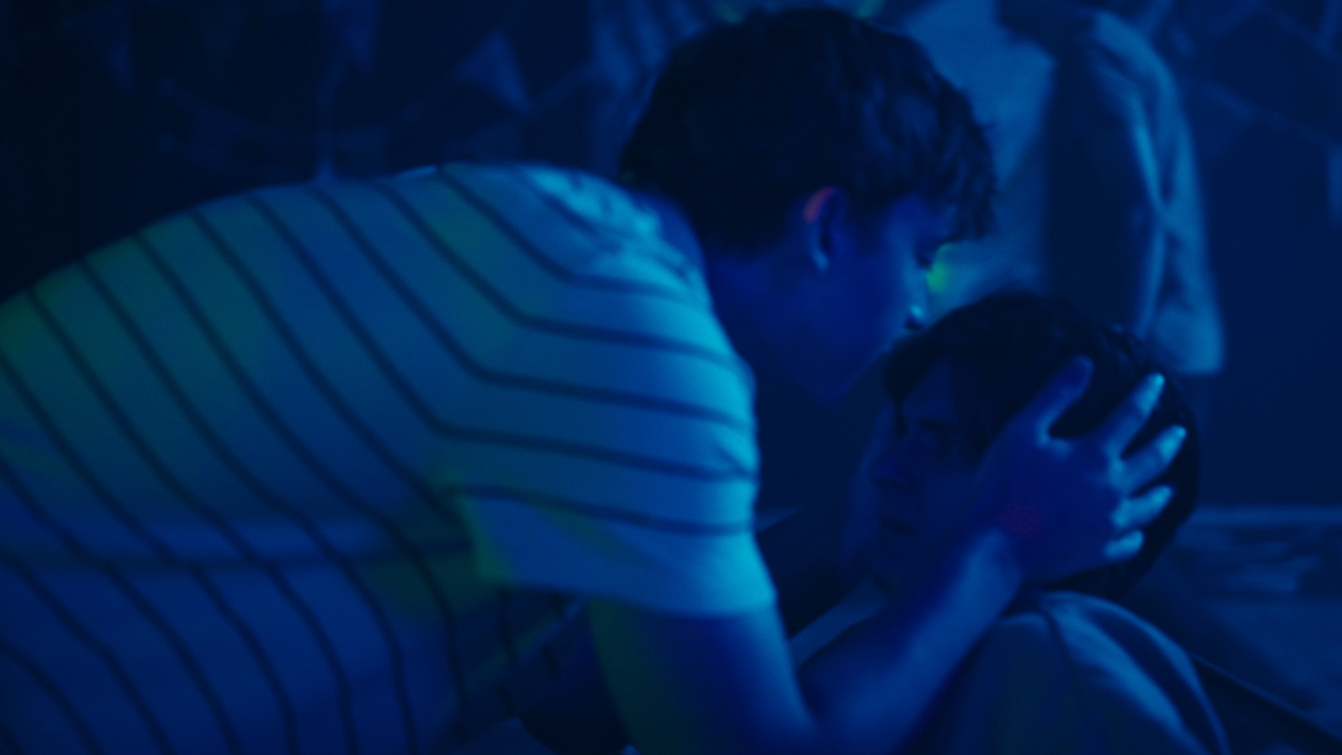
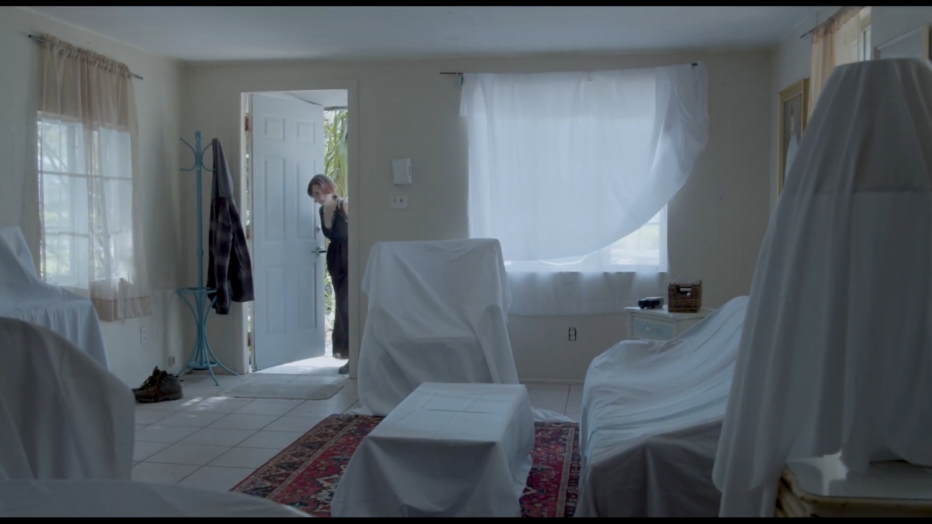
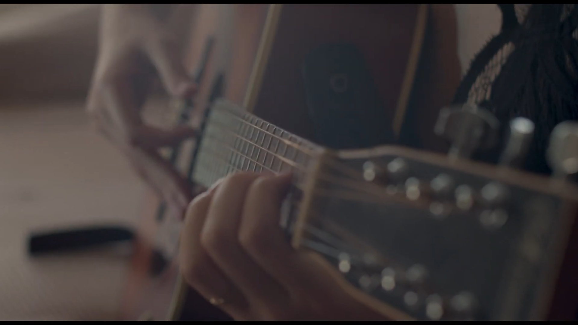
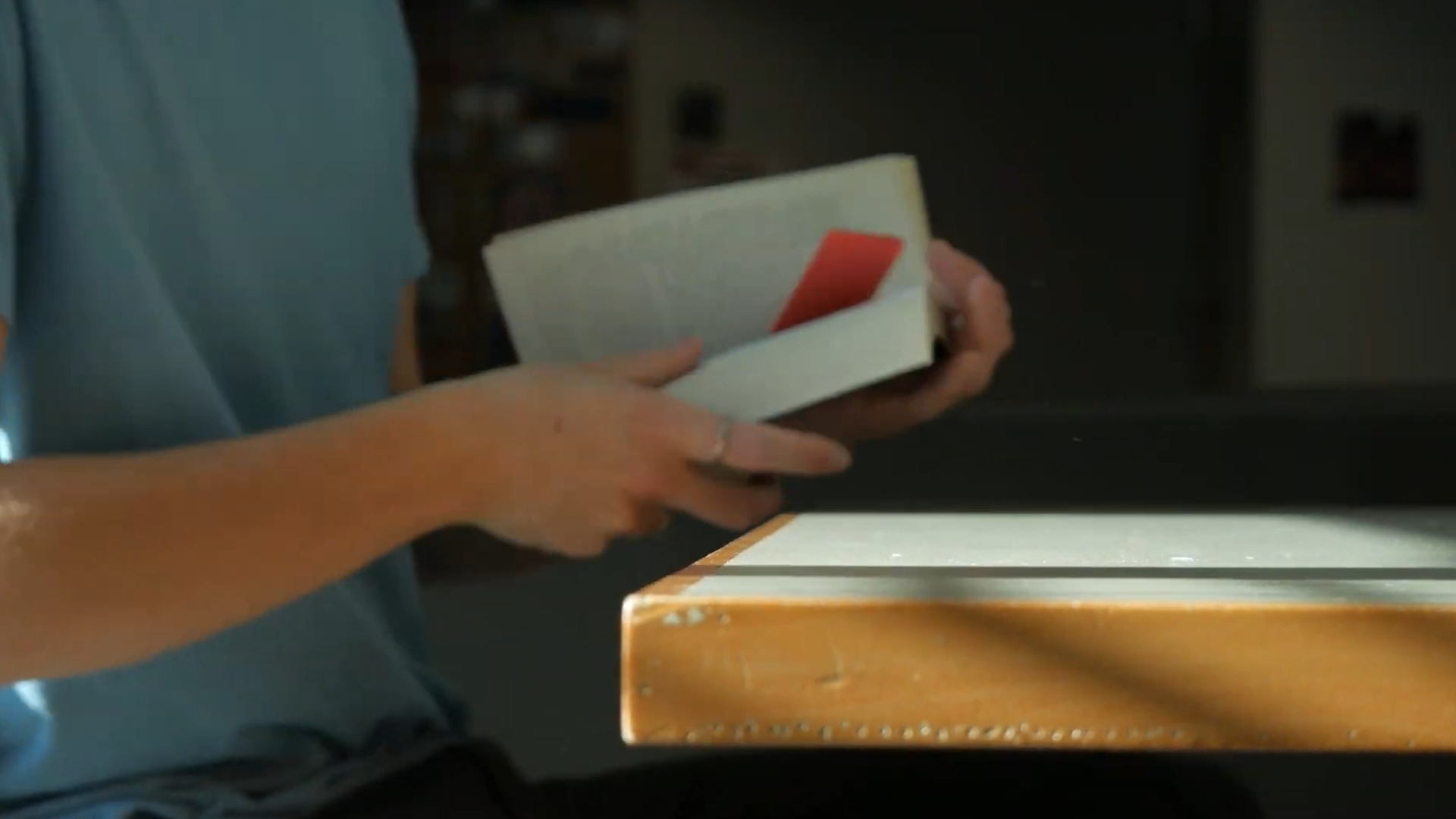
03 STYLE FRAMES
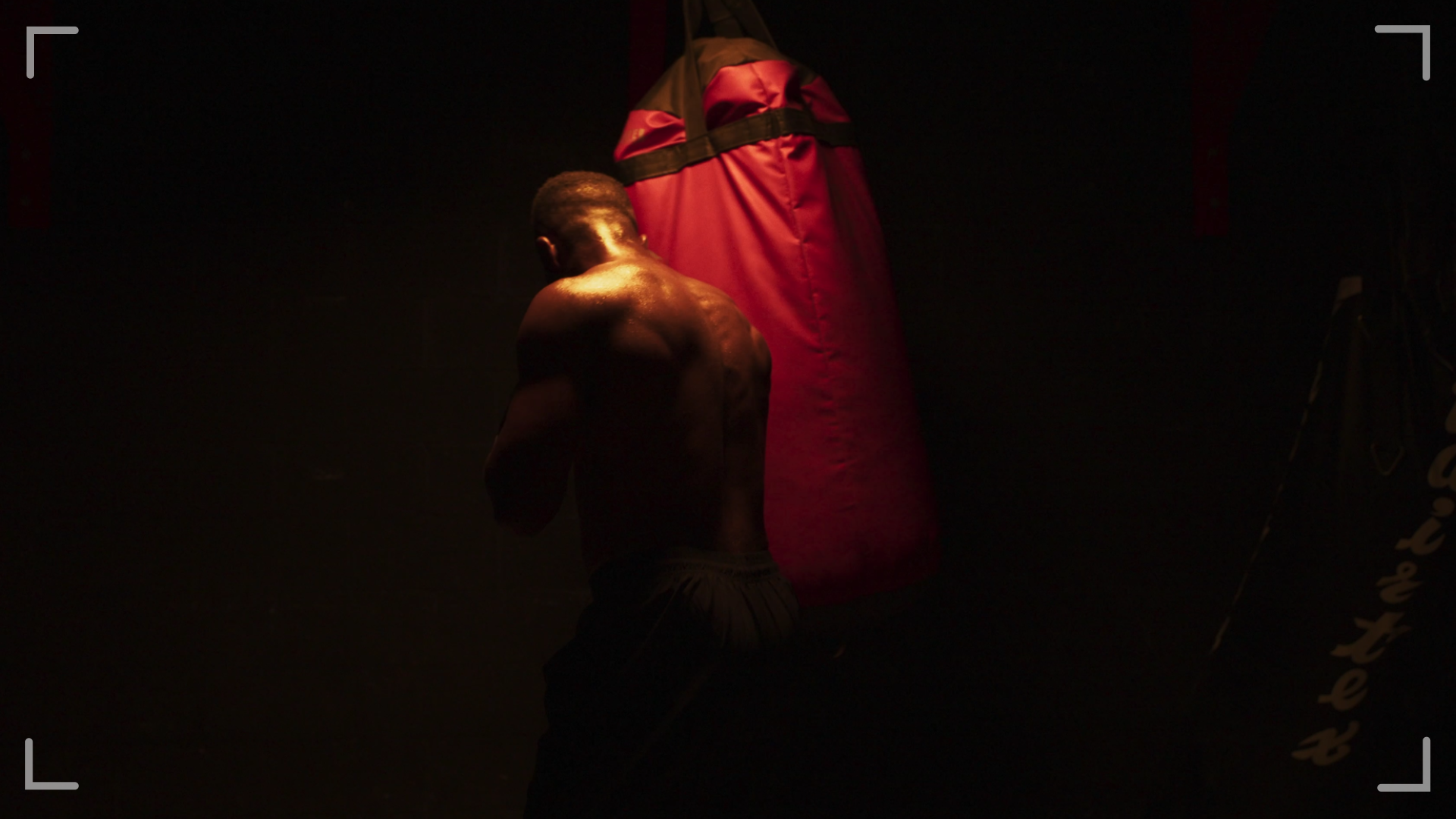
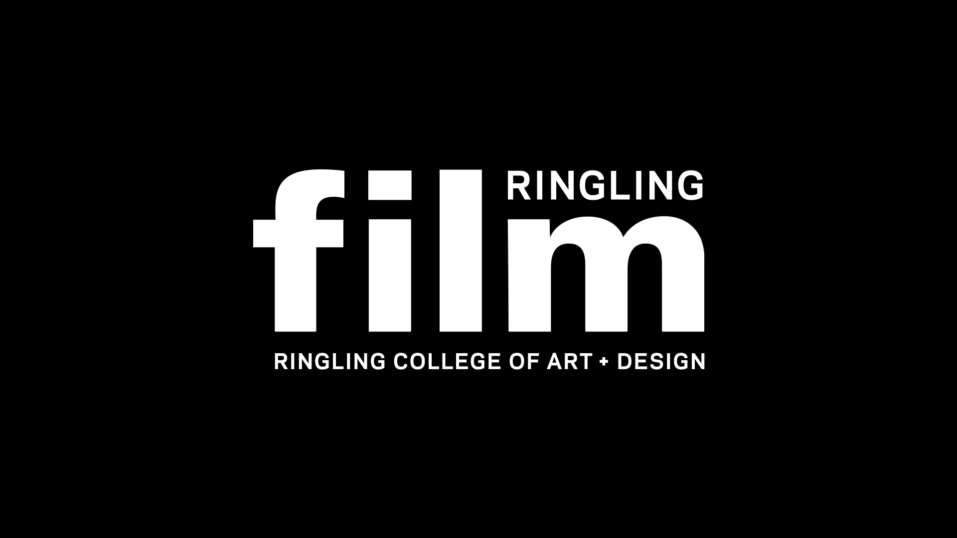
The style frames are all stills from various film projects. I added white corners and a red dot to pay homage to the filming process - recording. The final style frame is the Ringling Film Logo. It's big and bold and hard to ignore.

04 ANIMATION
The first pass was a test of timing and sync to track. I knew that I wanted the audio to build but never fully resolve. This builds excitement for the film. The ident isn't mean to be the star of the show.
Shots repeat multiple times because I was still gathering footage.
The second pass features a wider collection of student footage. I also wanted to play with the idea of the recording interface to highlight to process over the product.
05 HOW?
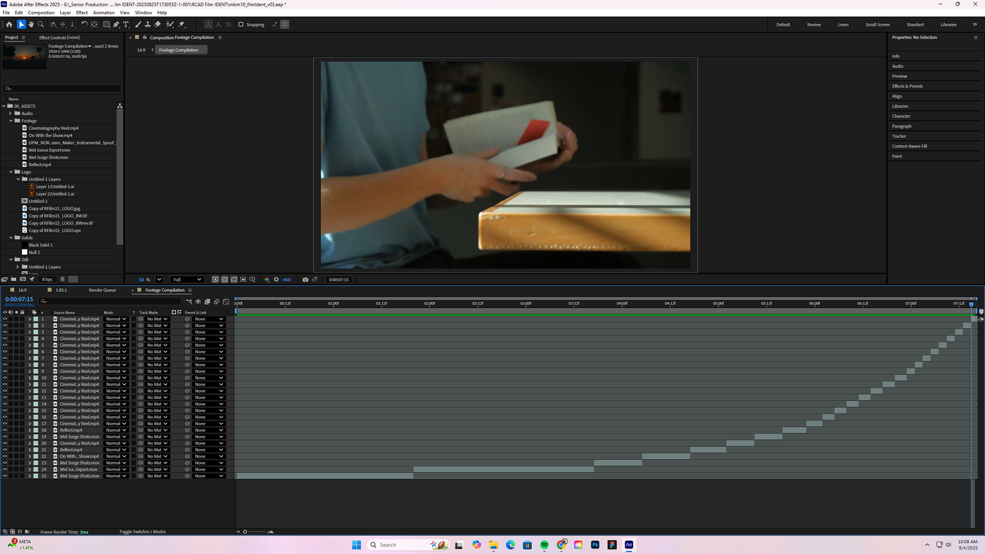
The clips were broken apart in premiere and synced to track in After Effects. I wasn't sure if I wanted to animate transitions, so I wanted that option to be open.
For the logo, I masked out each individual letter in "Ringling College of Art + Design" and animated the position changes. I adjusted the eases all together to keep it consistent. Then, I offset each letter by two frames to make it more fun.
The main logo flickers by changing opacity. The look pays homage to how old films would flicker.
06 DELIVERY
The final deliverables were two different videos: one in 1920x1080 and another in 1999x1080
1.85:1 Ratio
16x9 Ratio
A very special thank you to Danny Connolly and Riley Moore for allowing me to use their work in this project. I love you guys <3
